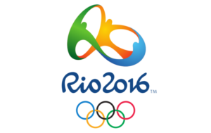
 It’s fascinating to witness the controversy and uproar that has been caused by olympic logo design. Much like the sports that athletes compete in, it seems that people who normally would not care whatsoever about graphic design suddenly become super passionate and opinionated on the matter. London’s 2012 Games branding is a spectacular example. People found it aggressive and unattractive, but the novelty and uniqueness has made it memorable. Though there was much speculation about this year’s games being a bust; ya know, with Zika and the whole preparation thing…the visual identity of this Rio Olympics was extremely thought-out and tried to adhere to traditional “sporting” & “global” design standards.
Don’t get me wrong, the logo and branding of the Rio games has still faced its fair share of criticism, and I can’t say that I was completely sold when I first saw it. It seemed almost too on-trend with the use of gradients and custom brushscript typeface…and yet simultaneously out-dated and childish with the amorphous dancing people. However, if you think about all that Rio-based advertising agency, Tatil, had to accomplish with this logo and all the symbology that they were able to fit into one small logo, I feel that they really succeeded. The challenge that they were presented with was “to represent the Passion and Transformation of a city and an entire country, and project these values to the rest of the world.” On the official Rio 2016 website they have stated that, “The visual identity of the Rio 2016 Games is inspired by the harmonic diversity and contagious energy of Brazil’s people and Rio de Janeiro’s exuberant nature.” They expressed this both through their color choices and an abstract reference to Rio’s Sugarloaf Mountain, a landmark mapped in the shape of the logo.

The widely celebrated graphic designer, Milton Glaser, known for the I ❤ NY logo, the psychedelic Bob Dylan poster, and the Brooklyn Brewery logo, has graded this games’ logo a 85 out of 100 – a solid B. His assessment was, “A presentation that looks fresh and contemporary. The athletes joining hands at the top are executed in a way that works well with the other elements. It feels like something new”.
Sources: https://www.creativereview.co.uk/cr-blog/2011/january/rio-2016-olympics-logo-a-closer-look/
http://eyeondesign.aiga.org/milton-glaser-analyzes-olympic-logo-design-through-the-ages/
