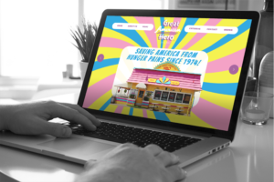
One thing I love about working at TIK:TALK is the collaborative, creative process that goes into each project. Here is some insight into what we go through when launching a new project. Let’s take a look at what went into developing the Great American Hero website.
Everything starts with a strategy meeting, where we talk about our goals for the project and the client’s goals, develop a timeline, which includes milestones/task to track how we are coming, and the branding/tone for our client. With Great American Hero, it was all about wanting to take the cool and retro part that is inside their building and conveying the overall look to their new website to showcase what they are all about. Once we wrapped the kick-off meeting, everything was delegated out into tasks – this is where the real fun begins!
The old website was a typical 90s website and full of pdfs instead of mobile-responsive text that offered functionality. It was also very unorganized and cluttered, but not in a fun way. It was important to keep in mind that the new site needed to be mobile responsive, interactive, and fun. The whole site was all custom made: we created a custom theme and graphics to go along with the website. The most important part of the job was to create a style guide that would allow us all to stick with brand standards, such as what colors we could use, how the logo should be used, and what typography should be used on the site. Sidney, our creative director, was in charge of this process while also coming up with a concept of how the header/main page was going to be set up, allowing me to come in and come up with the about us, menu and catering pages.

The main issue for our lead copywriter, Jerett, was to take the existing copy and give it a more purposefully random feel – a trademark of the Great American Hero brand. He also came up with the creative CTAs that are being used on the homepage with Sidney’s assistance on creating the graphics to go along with the text. Leo’s job as the web developer was to create the website and code it to allow the site to come alive from Sidney’s design concept. Because this was a fun restaurant we all had a really great time working together. Helping to create a great website that represents who Great American Hero is as a sandwich company was a fun process, one that we enjoy with all of our clients.
